Case Study Ahold Delhaize
Information design
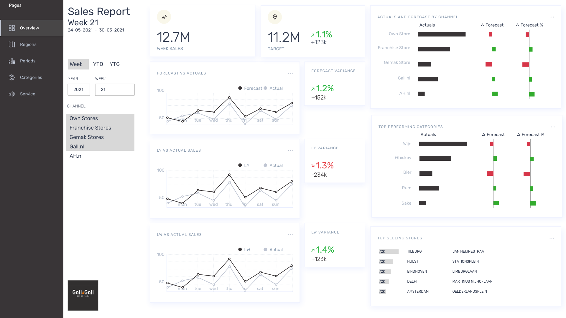
As an information design specialist working for the DataHub at Ahold Delhaize, my primary role was to establish effective connections between the various business units within the organization. By understanding the unique needs and objectives of each business unit, I created visually appealing and easily understandable dashboards, reports, and infographics that enable stakeholders to gain valuable insights and make informed decisions.
By ensuring a cohesive and user-friendly experience, I contributed to enhancing collaboration, efficiency, and overall data-driven decision-making across the Ahold Delhaize companies like Albert Heijn, Etos, Gall & Gall and more companies.
I thoroughly enjoyed working with the data teams at Ahold Delhaize for two years. The collaboration, learning opportunities, and vibrant environment made it a truly fulfilling experience.
Role: Senior UX Designer Big Data
2020-2021
Ahold Delhaize has many brands like Etos, Gall & Gall, Albert Heijn, who all do things a little different on multiple data systems. After interviewing product owners of the different brands and countries it became clear there were much more common data wishes than expected.
Observations
Much time is invested in manual data manupilation and emailing on a weekly basis in order to generate sales reports. Reporting is very different per department while the needs are pretty much the same. Even on a European level financial professionals want to see the same sort of numbers. Reporting is static and send via email. It is not possible to look back into time unless you save the reports send to your email. Departments can only react on last week's data since the reports are generated once a week. Most reporting is done with large Excel sheets and less frequent with Tableau or PowerBI.
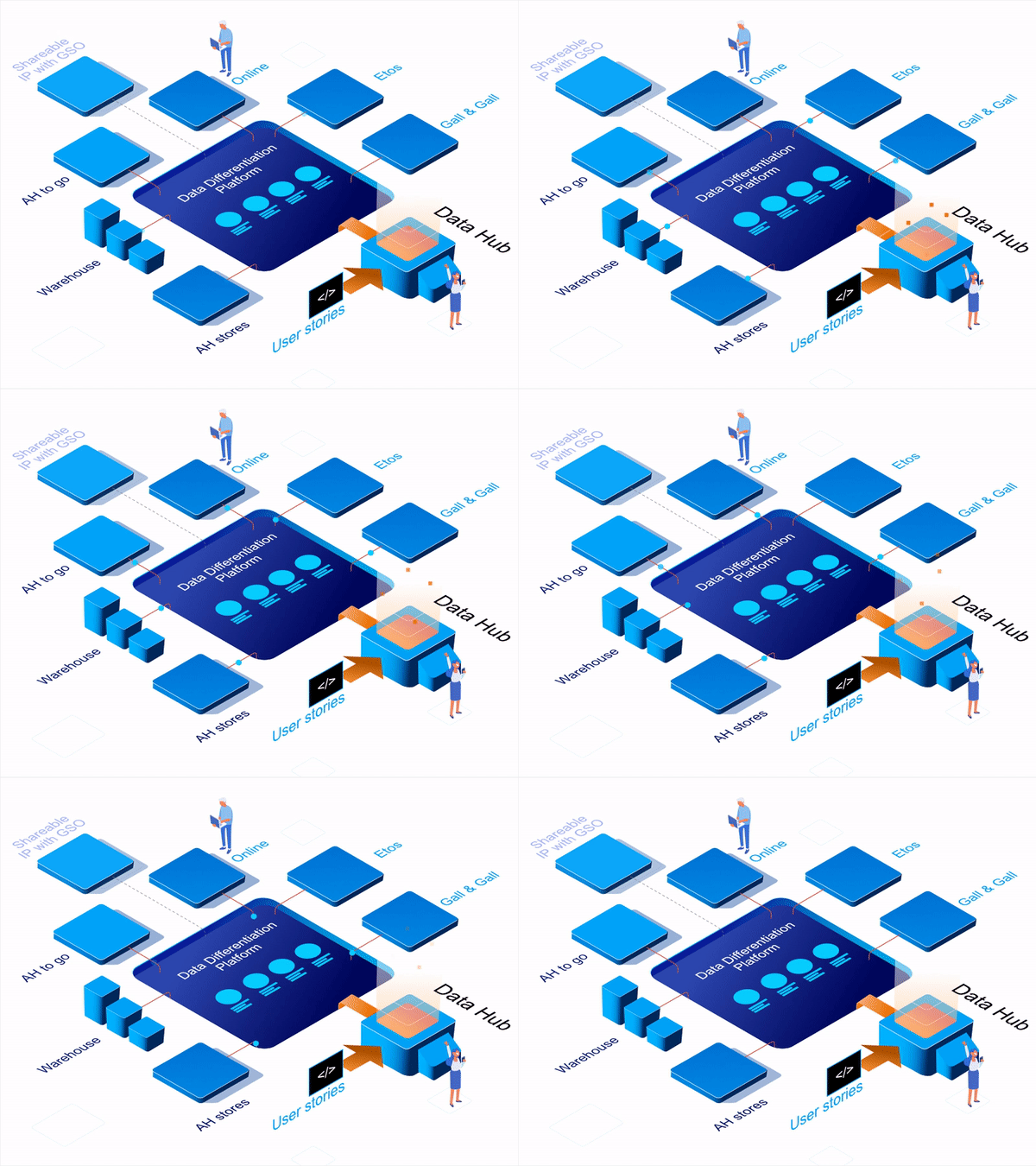
The DataHub @Ahold Delhaize is a platform enabling multiple departments to create powerful dashboards and learn from each other.
Insights
The Ahold organisation can save enormous amounts of man hours and become more responsive in steering sales by automating the availability of data and the choice of tooling to share the sales numbers Creating a set consistent report designs will save a lot of re-inventing the wheel throughout the companies and makes it possible to exchange knowledge cross organisation.
Specific tools
Power BI, Tableau, Processing, Sketch, Figma, PowerPoint optimisation, Sharepoint, Confluence, Jira, Affinity Designer
Experiences
- Designing and building Power BI dashboards based on Excel, Direct Query Azure connections
- Optimizing existing Tableau dashboards
- Working with Data Scientists and Engineers
- Indept knowledge of the Supermarket and food and beverages industry
- Data driven design

Visualising progress on multiple projects and initiatives
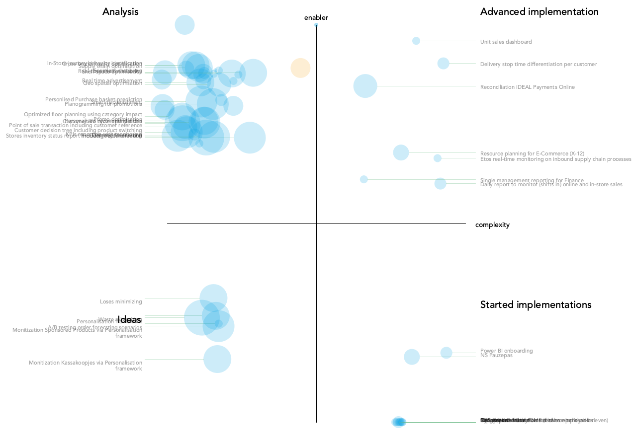
The Data differentiation platform involved many initiatives running at the same time. Centralizing all data in a single datalake for so many companies wasn't a small operation. I wrote a small script that translated a big excell sheet that was updated weekly with all the progress of the different projects. Every week the bubbles were supposed to move to the middle. The bigger the bubble the larger the impact.

Very large and not easy to read excel sheet with weekly updated progress per initiative:


